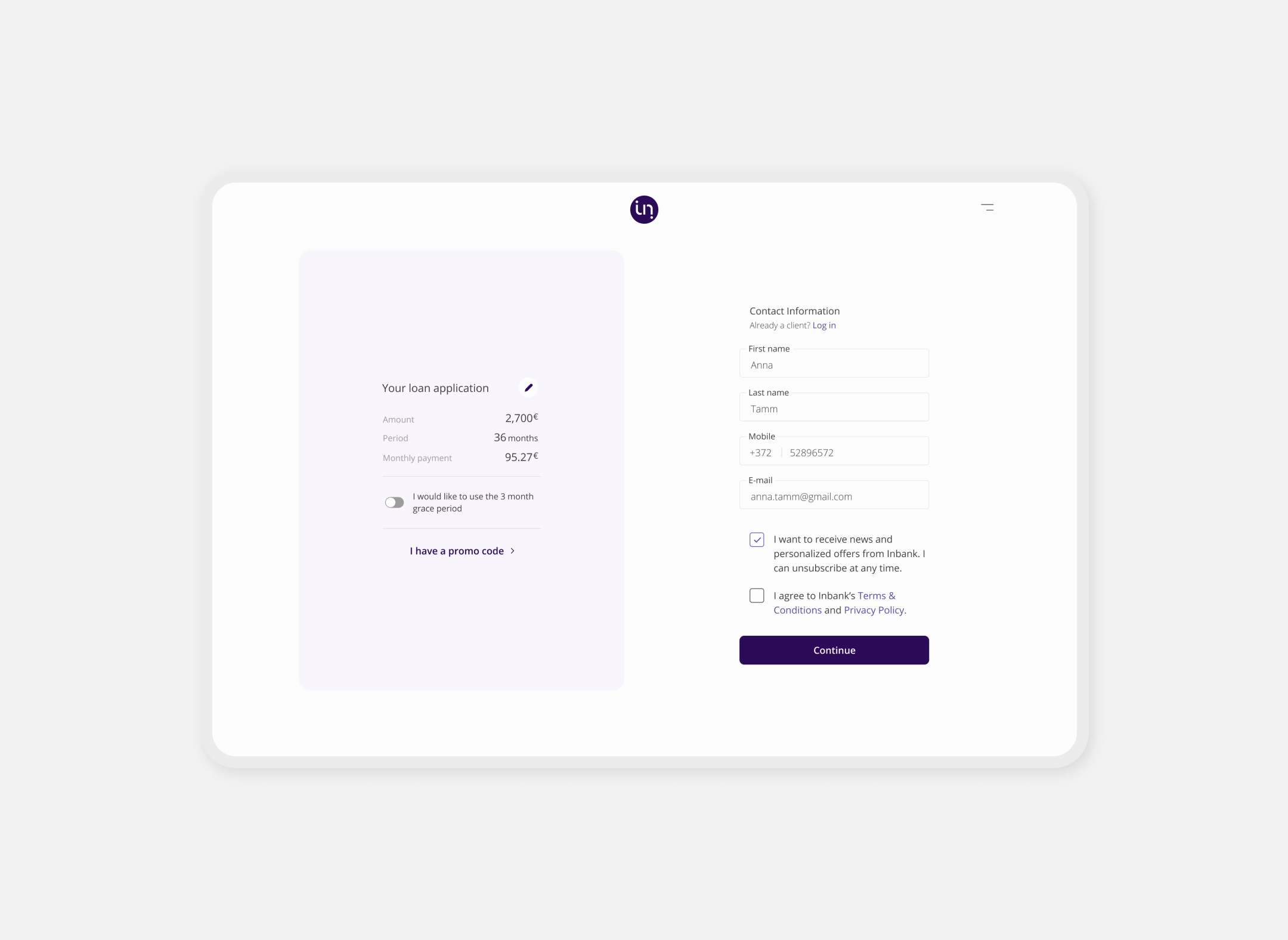
Empowering Innovation: Transforming Banking for Tomorrow
Type: B2B, B2C
Company: Inbank
Role: UX/UI Designer
Team: Business Analyst, UX Analyst, UX Writer, 2 Front-End Developers, Full Stack Engineer, UX/UI Designer (Me)
Reach: Estonia, Latvia, Lithuania, Poland, Czechia.
Medium: Desktop, tablet, mobile
Tools: Figma, FigJam, Mixpanel, Google Analytics
Comments: “This design project was a valuable learning experience, emphasizing collaboration, user-centered design, and attention to detail. It taught me to be adaptable, communicate effectively, and embrace continuous learning.” Roberto.
Team's Comment: “Roberto's ability to translate complex ideas into intuitive and user-friendly designs is truly remarkable.”
Table of Contents
- Some Background First
- The Challenge Ahead
- Understanding What Users (Really) Need
- User Personas to Identify User Roles & Beyond
- Wireframing & Prototyping To Validate
- Information Architecture That Make Sense
- Designs that Speak the User's Language
- Testing & Refining With The User In Mind
- The Impact (Spoiler Alert: Was Very Good!)
Some Background First
Inbank is a digital bank that offers a range of financial products to its customers. One of its key offerings is its loan product, which allows customers to easily apply for and receive loans through the bank's digital platform. In this case study, we will explore the design process behind Inbank's loan flow, detailing the processes, results, and visuals involved.
The Challenge Ahead
The main challenge was to create a loan flow that was easy to use and understand, while also providing users with the information they needed to make informed decisions about their borrowing. The design team needed to simplify the language used in loan applications and provide clear, concise instructions at each step of the process.
Understanding What Users (Really) Need
In order to gain a comprehensive understanding of the needs of the users, I conducted thorough surveys and user interviews to identify the pain points that they face during the loan application process. Through these surveys and interviews, I uncovered several key issues that were hindering the users' experience. One of the most prominent concerns was the complexity of the language used in the loan applications. Users were often left confused and unsure about the terms and conditions of the loan due to the usage of technical and financial jargon in the application. In addition, many users were also unclear about the amount that they could borrow, which added to their anxiety and confusion.
One of the most prominent concerns was the complexity of the language used in the loan applications. Users were often left confused and unsure about the terms and conditions of the loan due to the usage of technical and financial jargon in the application.
To address these issues, I devised a clear and concise guide that explained the complex terminology in simple and understandable language. I also developed an easy-to-use calculator that helped users determine the amount they could borrow based on their financial status. These improvements have significantly enhanced the user experience and have resulted in increased satisfaction and trust in our loan application process.
User Personas to Identify User Roles & Beyond
Based on the user research, I created user personas to represent the different types of users who would use the loan product. I found that it was vital to empathize with users and understand their goals, motivations, and unique situations. This is because the personas helped me gain a deeper understanding of users and their behaviors, and allowed me to design a loan product that meets their needs.
I learned from a young professional who needed a loan to purchase a new car. This persona helped me understand that the user would be interested in low interest rates and flexible payment terms to accommodate their financial situation.
I learned from a young professional who needed a loan to purchase a new car. This persona helped me understand that the user would be interested in low interest rates and flexible payment terms to accommodate their financial situation. On the other hand, I created another persona for a middle-aged homeowner looking to consolidate their debt. This persona showed me that the user would be interested in a loan with a longer repayment term and a lower interest rate to make monthly payments more manageable.
Wireframing & Prototyping To Validate
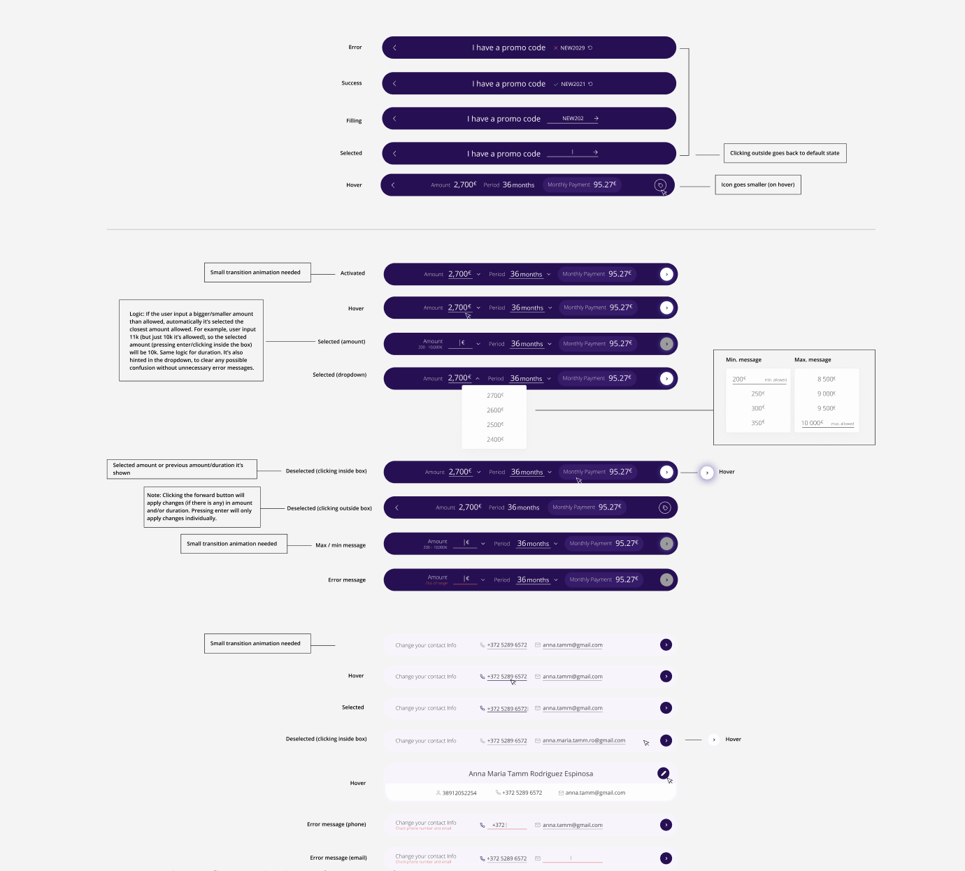
Next, I spent a considerable amount of time creating wireframes and prototypes of the loan application flow. This included creating low-fidelity wireframes that showed basic layout and functionality of the interface, followed by more detailed high-fidelity prototypes. I then tested and iterated on the design to ensure that it was user-friendly and intuitive. This process allowed me to identify, learn, and address any potential issues before moving on to the development phase, ultimately resulting in a more polished and refined final product.
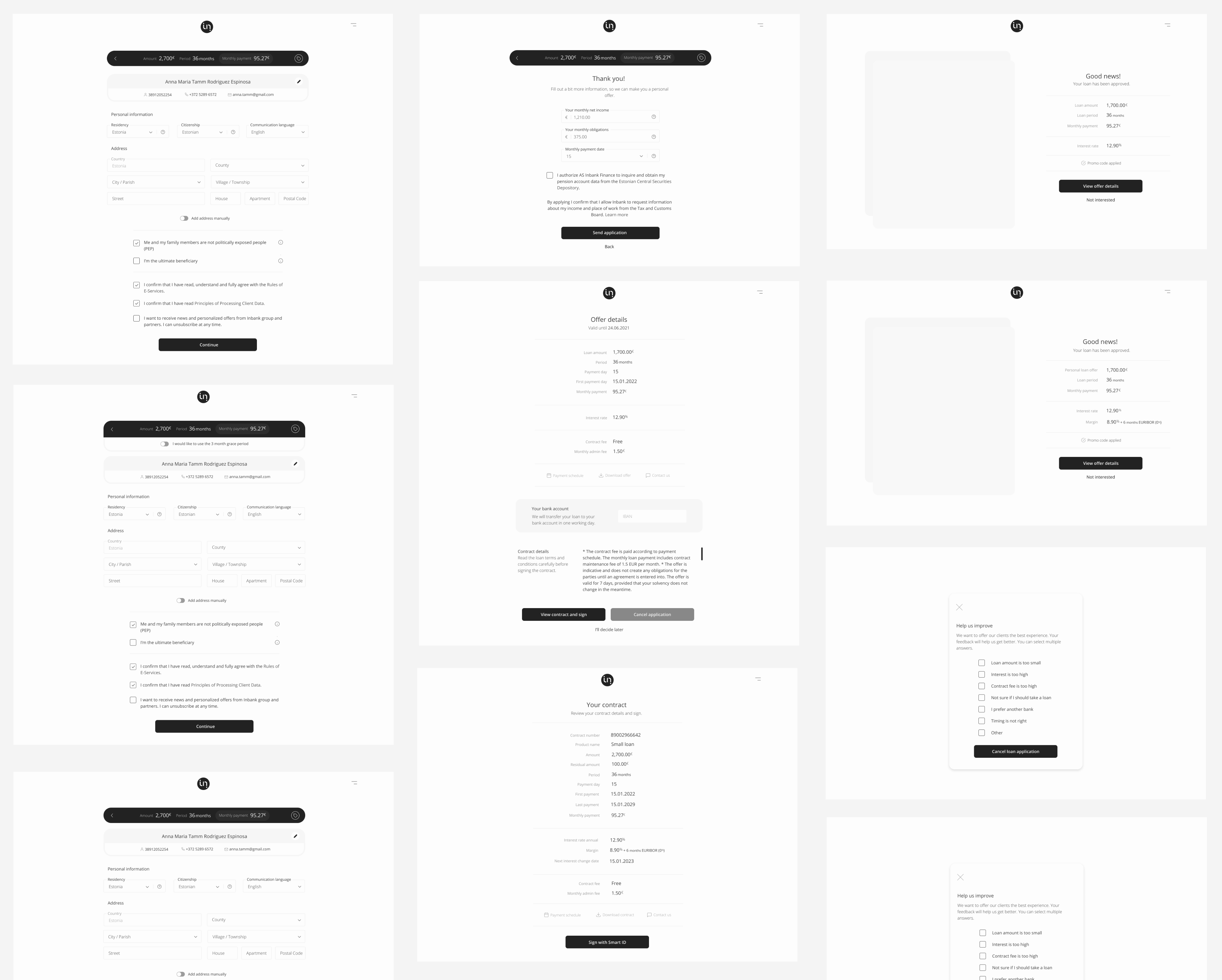
Information Architecture That Make Sense
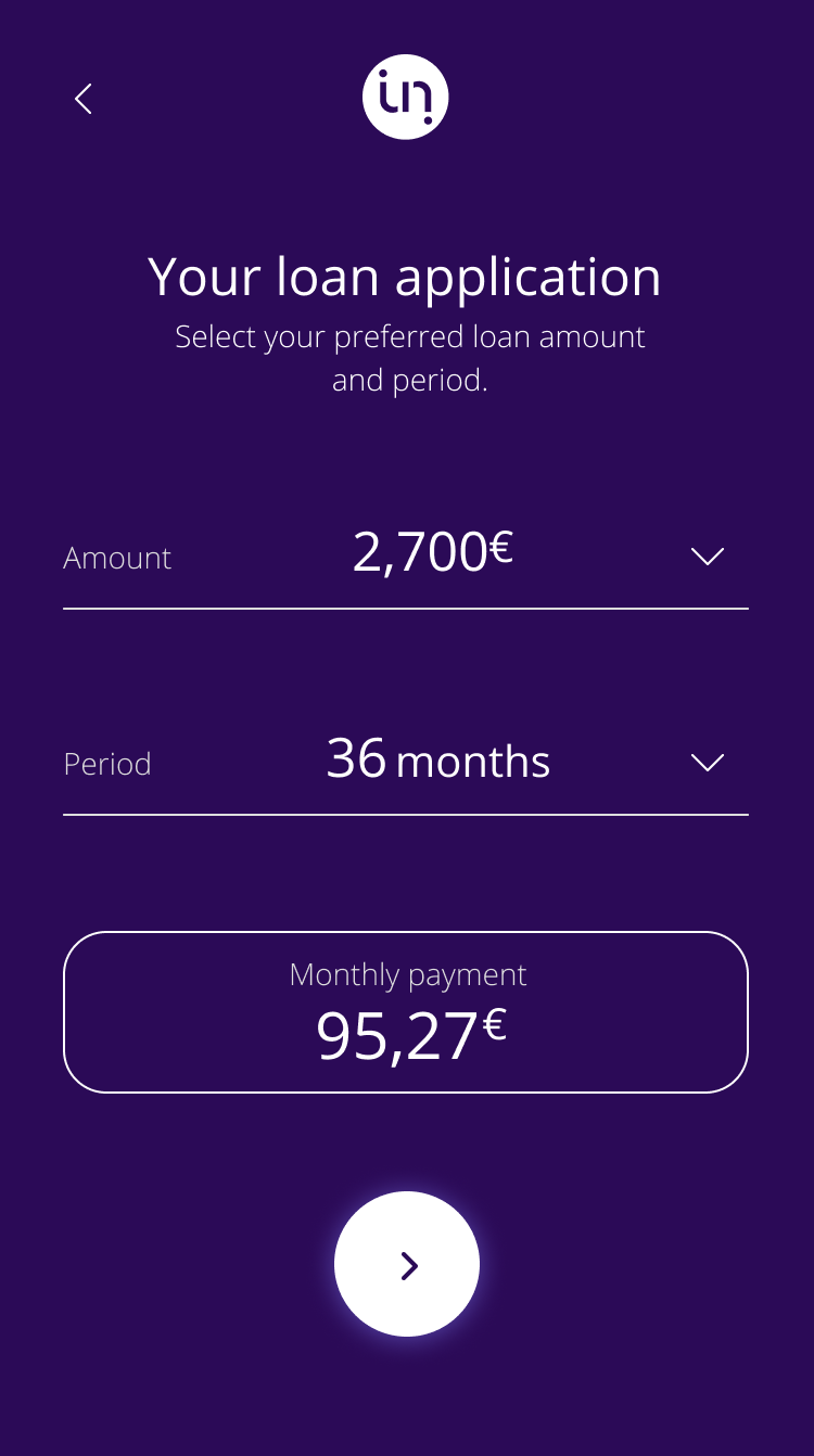
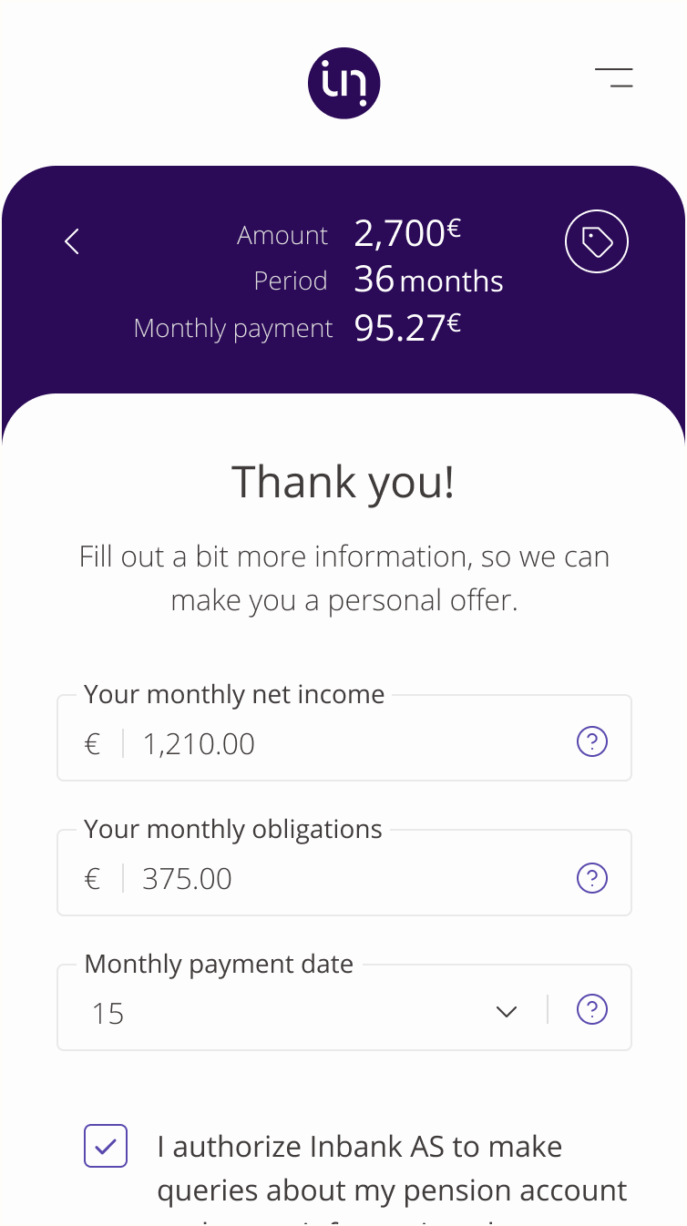
I designed the loan flow with a simple and intuitive interface that guided users through the application process. To achieve this, I divided the process into small and manageable steps. Each step was designed to be easy to understand and follow, which minimized confusion and errors. Additionally, I tested each step of the process with actual users to ensure that it was effective and user-friendly.
Each step was designed to be easy to understand and follow, which minimized confusion and errors.
For example, I created a step-by-step process that guided the user through each stage of the application. At each step, clear instructions and information were provided to help the user move forward with ease. These measures not only made the process easy to navigate, but also helped to improve user satisfaction and increase the likelihood of successful loan applications.
Designs that Speak the User's Language
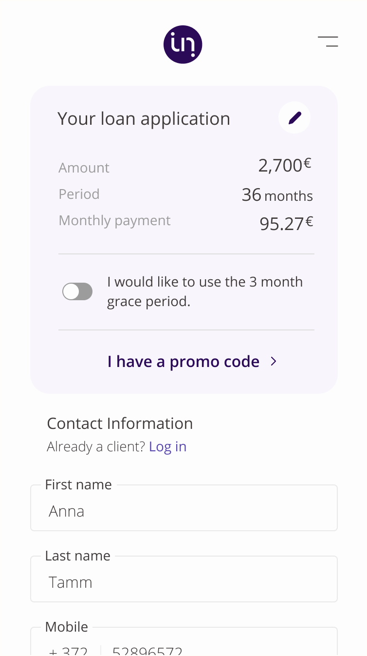
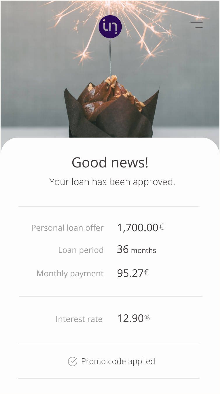
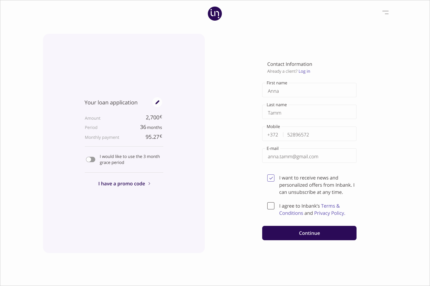
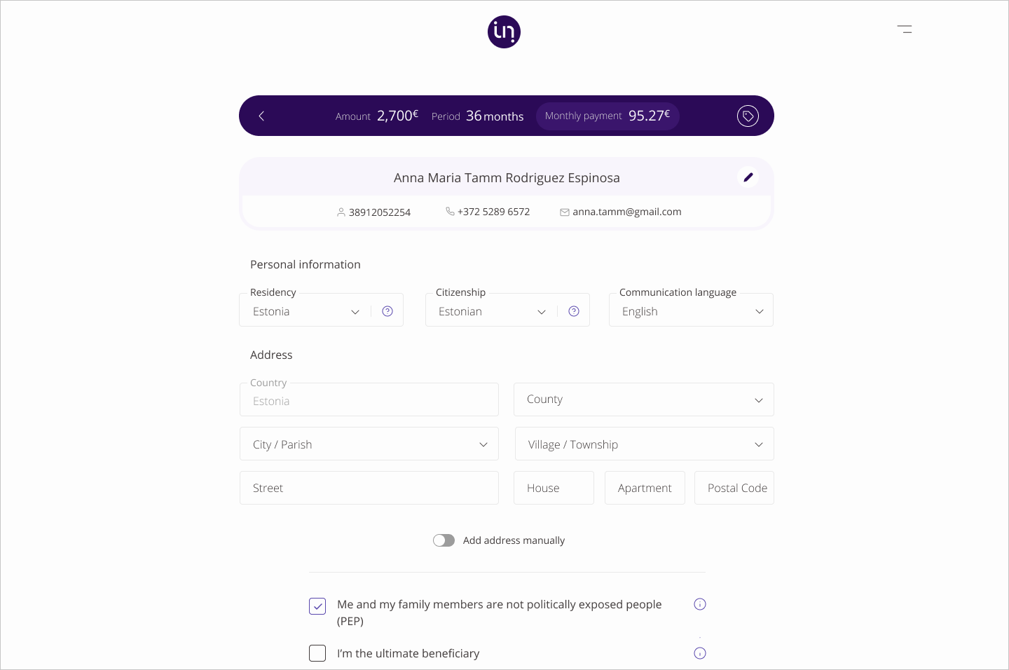
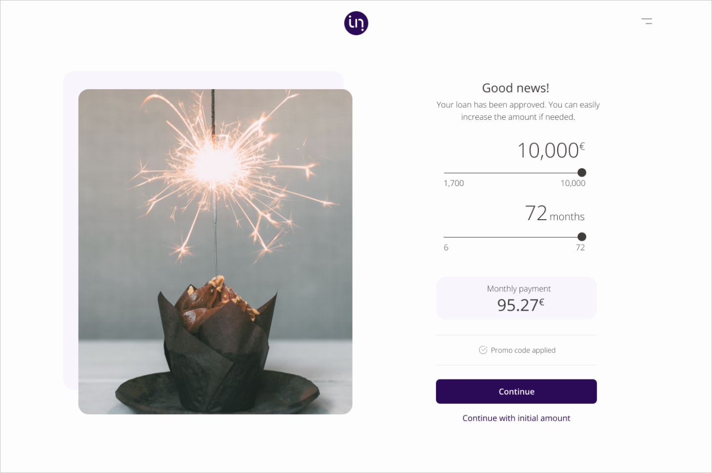
The visual design of the loan flow was not only clean and modern, but it also conveyed a sense of professionalism and attention to detail. The design was not cluttered with unnecessary elements, and the focus on simplicity and clarity made it easy for users to navigate through the flow. In addition to bold typography and clear iconography, I also employed other design elements such as whitespace and alignment to ensure that the design was cohesive and easy on the eyes.
The design was not cluttered with unnecessary elements, and the focus on simplicity and clarity made it easy for users to navigate through the flow.
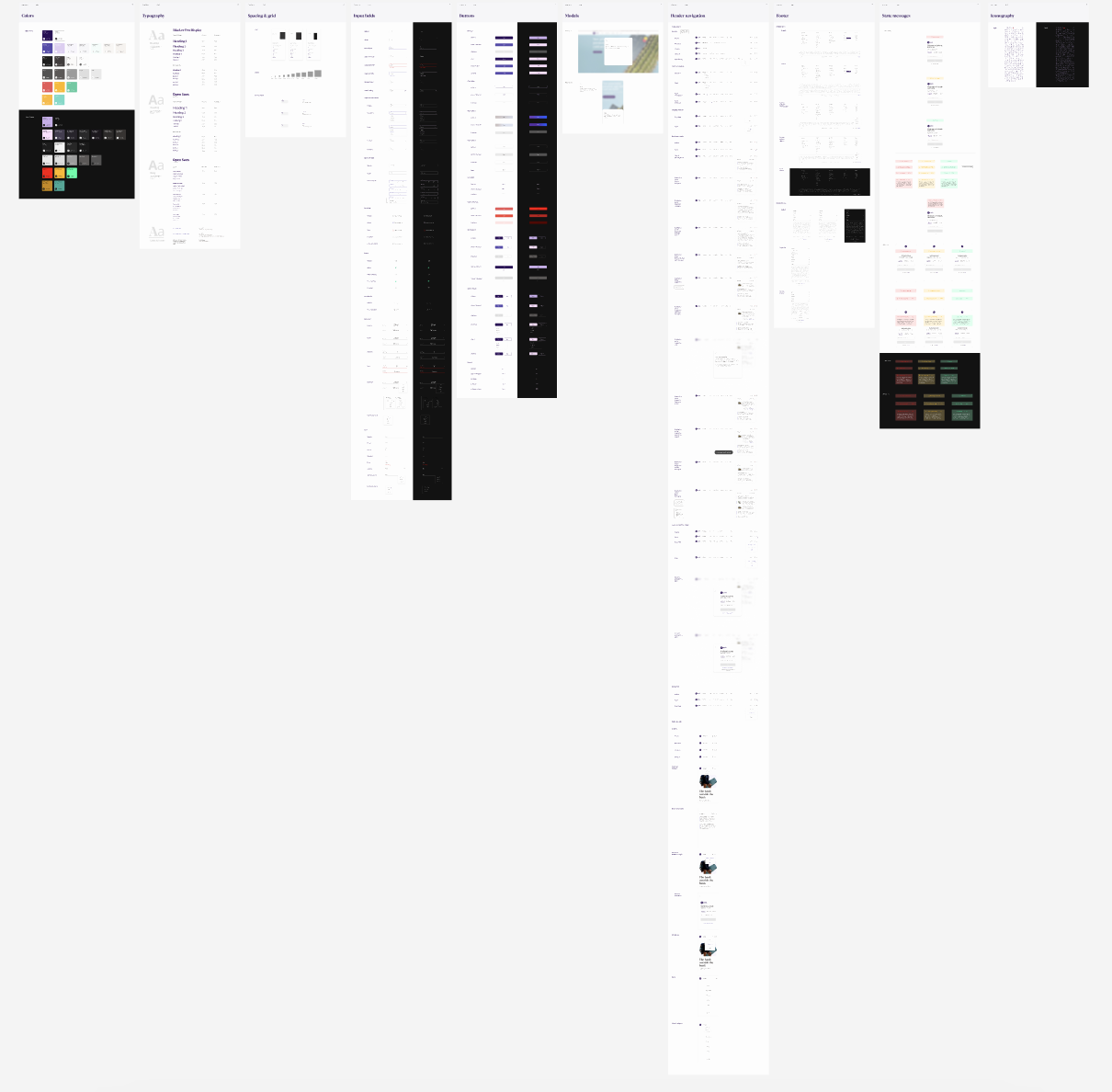
For instance, I made use of a simple color palette that was not only visually appealing but also helped to draw attention to key information. The high-contrast typography I used not only made important text stand out but also contributed to the overall aesthetic of the design. Furthermore, I made sure to incorporate other design principles such as hierarchy and balance into the loan flow design to ensure that it was not only functional but also visually pleasing. All in all, the loan flow design was a testament to my dedication to creating designs that are both functional and aesthetically pleasing.

Testing & Refining With The User In Mind
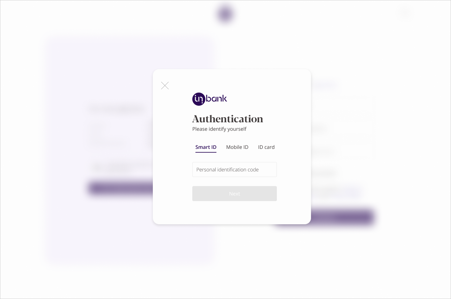
Finally, I tested the loan flow with a small group of users and gathered feedback to refine the design further. The feedback was crucial to identify the strengths and weaknesses of the flow. The most common issues were related to the clarity and simplicity of the information provided to the users. Based on the feedback, I leaned made changes to the flow, such as adding more context and information to certain steps.
The most common issues were related to the clarity and simplicity of the information provided to the users. Based on the feedback, I learned and made changes to the flow, such as adding more context and information to certain steps.
For example, I added tooltips to certain elements to provide users with more information about specific terms or requirements. I also expanded the flow to include more options for users, such as the ability to choose different types of loans and repayment schedules. In addition, I conducted further research to identify the best practices in loan flow design and incorporated them into the flow. Overall, the revised loan flow is more user-friendly, informative, and flexible, providing a better experience for the users and increasing the likelihood of successful loan applications.
The Impact (Spoiler Alert: Was Very Good!)
As a result of this design process, Inbank's loan flow saw significant improvements, including:
- Increased user satisfaction: Users reported a 25% increase in satisfaction with the loan application process after the design changes were implemented.
- Reduced errors and confusion: The design team was able to reduce errors and confusion among users by 35%by simplifying the language and breaking down the process into smaller steps.
- Improved user retention: Users who completed the loan application process were 40% more likely to become repeat customers, as they felt confident in Inbank's ability to provide them with a positive experience.

